Nathalie Gordon
Creative Partner. OG blue-ticker. Sometimes found going 'viral'.
ASDA are, and always have been, the people’s champion. Forever striving to give their customers and their families the very best quality and value possible.
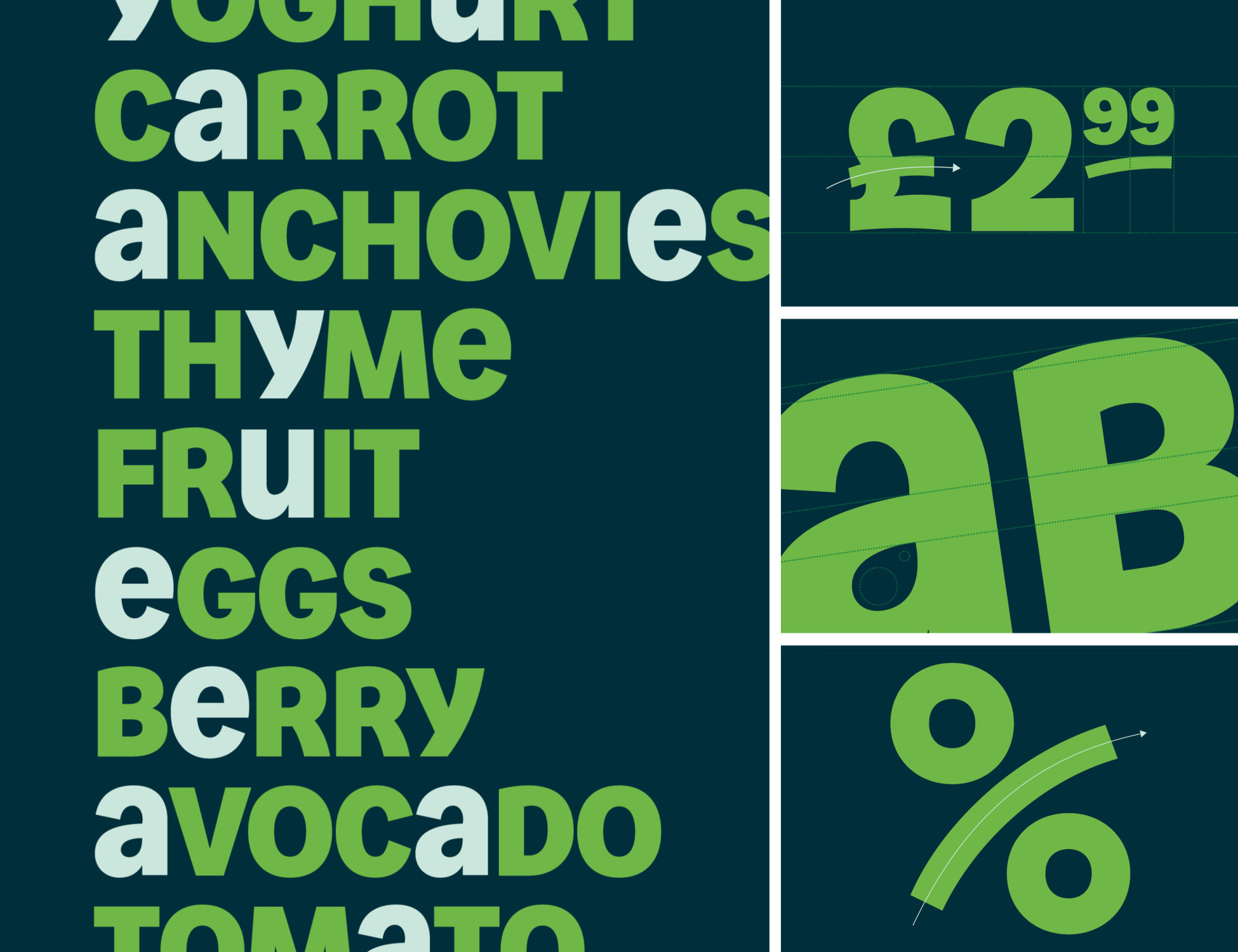
From putting accessibility at the core of colour and design, to creating a new tone that feels like the mate you want to get seated beside at a wedding, to even developing a unique font that allows copy to behave like it sounds, we've taken our new endline, 'That's more like it' and baked it into every corner of how ASDA now looks, feels and behaves.
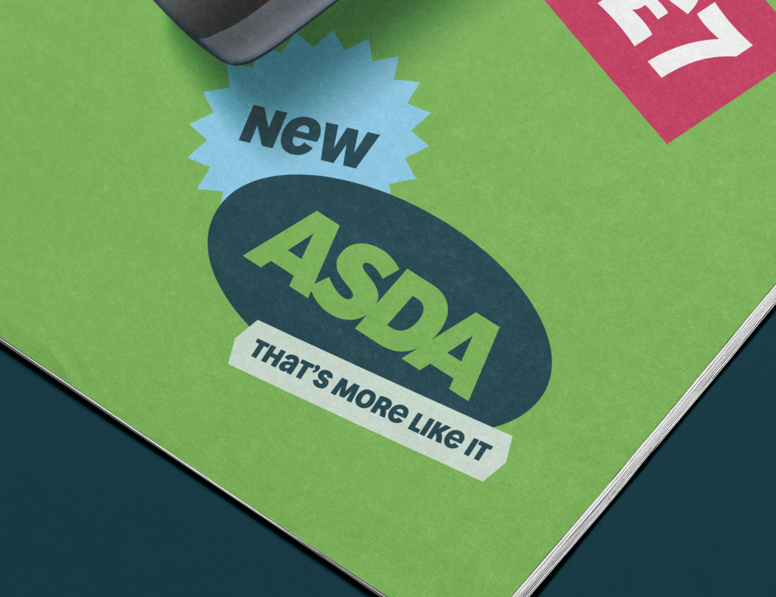
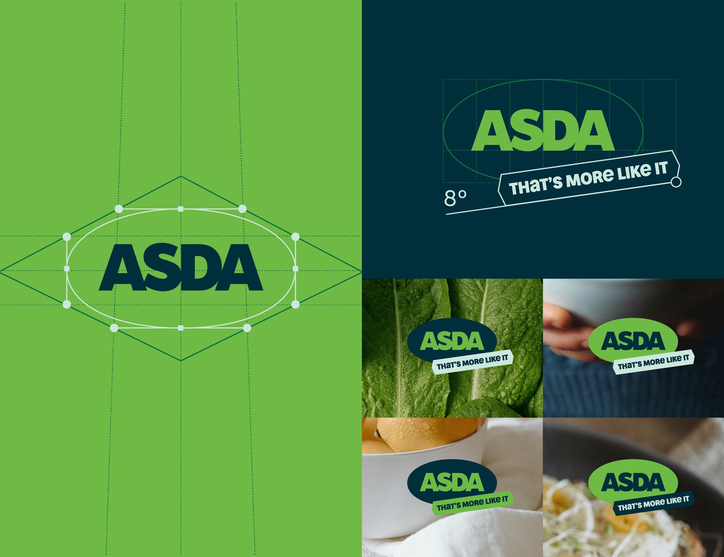
New logo, colour palette, graphic devices, icons, type face (courtesy of Colophon Foundry), photography approach, and tone of voice - all laddering up to a more personal brand that puts people, quality and value above all else.
This rebrand took around a year and a half to pull off (give or take a few stops and starts) and impacts almost every single part of the ASDA business.
Hard but rewarding and hopefully incredibly effective.


